Thursday, May 2, 2013

Check out our new bathroom!


The summer we bought the cabin was filled with major renovations.  The place we bought has an amazing yard - tons of outdoor space, 2 guest cabins, a garage, shed, and huge deck wrapping around our little main cabin.  But all of it was seriously run-down.  And, the bathroom was completely inadequate. 

The bathroom was so tiny, I couldn't get photos of it before.  But it was like this - the door swung in toward the toilet and grazed the bowl as it opened.  The tiny shower stall exited toward the toilet tank and there was literally just 12" of space between the two.  The sink was wedged into the 18" of space between the side of the shower and the door.  And, wouldn't you know, the weekend we took possession of the cabin is when our son wanted to start potty training!  It was beyond awkward trying to help him in that little tin can of a bathroom.  But, he was convinced.  And, when a kids wants to potty train, any parent knows, you do it!

But, that bathroom was also the first thing on our list to change.  We had to expand it.  A family of four simply cannot cope with a "barely a bathroom." The most interesting part is that beside the bathroom was a closet/room for the water heater which was almost as big as the bathroom!  So we stripped everything out, removed the wall between the two and built a feature wall out into the dining room space to hold the water heater.  The new bathroom is now comfortable, spacious and fresh.  It even has a full tub!  And, the coolest part is that we did the entire renovation for just $800.  All new fixtures, new walls, ceiling, floor - complete gut and re-build!  Oh, yeah, and a hell of a lot of hard work.  But, that's not fit for this post!

Once we'd pulled all the old fixtures, I had the goofy idea to set up the toilet in the back yard with the old medicine cabinet and get the kids to pose for photos.  We even told them that was our new bathroom and since they were only 3 and almost 5, they wide-eyed believed us :)  It was a hoot getting the photos of them, although she was very reluctant lol

Isn't it funny it took me almost five years to finally scrapbook that?  It literally took me until now to finally come up with a plan. I never forgot these photos, rather, just couldn't think of how to make that work.  The best part is that the kids had forgotten - it was awesome reminding them :)
This is another Scrapbook Studio kit!  I forget which month - it was one that I got too busy to get the layout done in time.  The paper is mostly Simple Stories and I'm not sure of most of the embellishments, although the film strip sure makes me think Tim Holtz!

Sunday, April 28, 2013

Nature, au naturel?


Sometimes, I'll be happily scrapping away and have a layout almost done, but get completely stumped on the title.  A while back, I shared that dilemma with my hubby who took a look at the layout and quickly blurted out an awesome title idea.  My mouth fell open and I ran back to my table to quickly get the words in place before I forgot his little pearl of brilliance. 

Well, over the years, I've turned to him a number of times for help with titles or ideas that just aren't working right.  He claims he doesn't really "get" scrapbooking, but appreciates the end product, so he's okay with acting as a consultant when I'm stuck.  But, he's adamant that he does NOT participate in this lol

Then, a couple months ago, Jason came to me with a page idea.  Yes, I just said that - he came up with the concept!  Interestingly, it was a title which would dictate a lot about the page - it was "Nature is every child's playground."  I loved it and immediately jotted it down along with some photo ideas (ones I'd have to find from old ones I'd printed). 

And, thanks to my category drawer and Stacy Julian's wonderful system, as well as a lack of current stuff to work on, I was able to locate those photos for the crop.  I love how it turned out!  The great papers allowed me to use photos from any season and they still worked.
The products were all part of a Crop & Create package that ROCKS!  The papers are Simple Stories, BoBunny & Jillibean Soup and letters & stickers by Jillibean Soup, October Afternoon & Basic Grey.

The design was inspired by a Becky Fleck sketch that I modified a bit to make it work.  But, I had way more photos than would fit in the layout, so I used a fun little washi tape trick to get 6 4x4 photos into a 4x6 space - LOVE washi tape =) 

I wonder what he'll suggest next ...


Friday, April 26, 2013

Running out of Photos?

I realize how ridiculous this may sound, but I've become so focused on documenting our lives through layouts and Project 365 that I'm pretty much up to date.  Yup, I said that - I've scrapbooked most recent things that I want to.

So, when I went to pack my things for a recent crop, I quickly realized that I'd need to search the archives to find some subjects.  A few years ago, my friend, Karen introduced me to Stacy Julian's Photo Freedom - a wonderful system of cataloguing your photos and organizing your scrapbooks.  It's brilliant and it works beautifully for any scrapbooker, making it easy to locate specific photos among your thousands.  Anyway, I pulled out my category drawer and found a bunch of old photos - from years past - that I had just never got around to scrapbooking.  I also found some old paper packs about the same age lol  And, those are the things I focused on at the crop!

This first layout is a kit I got - it was a make and take at the first Saskatchewan Scraps I attended.  I think it was 4 1/2 years ago, but could be wrong (that's a long time ago to remember for a brain like mine!).  I never put it together because I was stuck on what photo I'd use.  But, taking it along to the crop allowed me to think outside the box and when I set the recent photo from our Edmonton trip on the papers, I loved how the photo brightened it!  It also added the dimension I needed - I struggle using outdoorsy papers because I always want to use outdoorsy photos on them and the layouts end up looking flat.  But, putting a bright, indoor photo on this did the trick and I'm very happy with it!
I wish I could remember the manufacturer of this paper, but I can't - so sorry! 
This next item from the archives is something I've been meaning to use for ages, but keep forgetting!  In the fall of 2011, my sister had a plan to get her kids and my kids together for a formal photo shoot.  The photos we got were awesome, in large part due to the excellence of the photographer at, get this - Sears!  All four kids thoroughly enjoyed the photos and hammed it up.  But isn't it just sad that these photos sat in an envelope for 18 months?  I'll blame that on my swiss-cheese brain ...
The paper, chipboard and gems are Close To My Heart and the ribbon is Stampin' Up.  It's funny to me how the two companies are often seen as competitors, when their products tend to work beautifully together (although I've always been and always will be partial to CTMH :)
The column of wallet-size photos is something I've long wanted to do.  Interestingly, I ordered a whole page of wallets to give our family members in their Christmas cards, then forgot to put them in!  I was glad they finally got put to use lol.


Tuesday, April 23, 2013

Amazing young people ...


Do you ever marvel at a young person who handles a normally nerve-wracking situation with grace and ease?  Well, I got to see an amazing young girl play mc to a room of 50 women with confidence, humour and poise.

It's Amy's daughter, Faith, who mc'd the crop on Saturday.  She handled 90% of the microphone duties and did it with flair!  I was awed by her confidence in front of a crowd.  And, I wasn't alone in that feeling - the whole group of us were amazed at her.  You can see (the little blonde girl) how comfortable she is hanging out on stage with a mike in her hand!
The neatest part of the event is that they did this as a family.  Amy organized the scrapbooking and prizes, Brent handled the food and Faith entertained us as she mc'd.  She's an amazing young girl - I'm excited to see what directions she takes in life as she grows up :)

Now here's another amazing young girl - my daughter.  While she's not a fan of having a microphone in her hand, she certainly loves her dance.  A few months ago, she was feeling envious of her brother's hockey photos, so we staged a photo shoot of her and I came up with this photo collage.  It was fun to put it together for her using soft, feminine colours that reflect her personality :)
Everything in the layout is from My Mind's Eye - Follow Your Heart.  You know it's a great line when it's the only products you need :)

Sunday, April 21, 2013

Crop 'til you Drop!

Yesterday, Amy Peacock, along with her husband, Brent and daughter, Faith, held a crop to raise money for diabetes.  Brent's father, a diabetic, passed away last year and the Peacock family is supporting Brent's endeavour to run a marathon for the cause.  

So, Amy organized her scrappy friends to come together and enjoy a day of cropping, visiting and dozens of prizes.  Brent took care of ALL the food - snacks, drinks, lunch and supper were all provided and prepared by him!  He also taught us how to make record bowls (way cool!).  The records were donated by Tracy Penner's husband :)  And, we were able to buy more so we could make more bowls at home (I got an extra 5!).
The prizes were amazing!  There was a 50-50, 40 raffle prizes and silent auctions as well as many door prizes.  I came home with tickets to the man show (excited to take my hubby on a date night!), as well as a bucket of chicken from KFC, a pizza from Dominoes and 2 passes to Rainbow theatre - sounds like a great kids' date night!  The neatest part was Shauna, who attended with me, also won Man Show passes, so we might even get to double-date :)

But, for me, the best part was I got 7 layouts completed!  I have spent the last 2 weeks dealing with various health issues in our home - Jason was laid up for a week with his back (it was awful!) and my son was out for 3 days with asthma.  So, getting back to something I love felt so good!

The first two I'll share with you are using a kit by Kelly Goree that I got at Crop & Create in 2011.  She has such a fun, whimsical style.  I made a few modifications to her layouts to work in some photos of my kids that were taken - get ready for this - 4 years ago!  They got tucked away in my photo box and forgotten until I ransacked it Friday night.  They were taken by a wonderful local woman who set up a 'back-to-school' photo shoot the year my daughter started Kindergarten. 
This layout is very similar to Kelly's aside from the addition of 3 smaller photos and some pinwheels.  It uses Basic Grey and My Mind's Eye papers and Basic Grey letters and pinwheels.

This layout had much more focus on red, which simply wouldn't work with my daughter's dress.  So, I subbed in a couple papers and painted the red flowers around "wonderful" with Taffy Smooch as well as adding 2 more small photos.  The papers are by My Mind's Eye, Basic Grey, BoBunny, Jillibean Soup and letters by Basic Grey.
So, not only did I get my mojo going again, I enjoyed using products that I'd had waiting far too long.  Ahhh ... thank you so much Amy, Brent and Faith!
 

Sunday, April 7, 2013

Studio Kits ROCK!

Each month, the Scrapbook Studio in Saskatoon makes up kits for $10.  I've subscribed to the monthly kits for quite awhile and have come to really appreciate the awesomeness that is placed into each one!  If you use your kit to make 2 layouts and return it them the store for display by the 20th of the same month, you're entered into a draw for a $15 store credit!  Great deal, eh?

This month's contained papers from the So Noted line by Carta Bella - gorgeous!  I was so inspired, I had to use it right away :)  And, wouldn't you know, I had some great photos from our Edmonton trip to use with the kit.  

My daughter was enthralled by the lighted fountains in the mall and when we arrived Wednesday morning before the stores opened (we're early-birds), it was quiet and the perfect time to get a couple photos of them. I love that the kids don't mind posing for pictures :)
This was the paper that first caught my eye - love the colours!  Maybe Cayla was thinking of me when she chose it (tee hee).
When we woke Wednesday morning, there was a beautiful sunrise out our window.  I took a photo and thought of the awesome title my friend, Laurali had done years ago.  Just had to do a similar one with mine.  So, while it's hard to see in this photo, Edmonton is cut out of a photo of the downtown skyline at dawn :)
This layout is inspired by a Lisa Day sketch from a class I took last year - 28 Days of Sketches through Big Picture Classes.  Totally awesome for inspiration!  I refer to my binder with all the sketches printed out lots :)
 

Saturday, April 6, 2013

First Concert Experience

It was a pretty cool thing taking the kids to Bon Jovi this week - their first concert ever.  It was one of those things that just kind of fell together for us, like it was meant to be.

When we first planned our trip to Edmonton, it was simply to be a little getaway from everything.  It's been a busy and stressful few months and some family time away was just what we needed.  So, Jason found a hotel at a rate we liked and we booked it.  Then he discovered that while we were there, so was Bon Jovi!  I figured we'd never get tickets, but it turns out that in Edmonton, there are secondary ticket sites where you can buy tickets from a third party.  And we found tickets - for just $20 each!

The catch was that the tickets stated they were "behind the stage" so I realized that we might have a compromised view.  But, we figured that the concert experience would still be worth it and purchased them.  It turns out that behind the stage was really not accurate as Jon Bon Jovi played to the fans behind the stage!  We ended up with far better seats that most people in the stadium who had paid much more than us! 

Although Richie Sambora left the tour the day before, Bon Jovi certainly did not disappoint.  The fill-in guitarist did a good job covering and Jon pitched in with guitar as well.  But, hands down, my favourite part was when they played my favourite song "We Got it Goin' On" and Jon danced on the hexagon pillars that moved up and down along the back of the stage!  Way cool :)

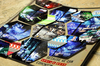
That, of course, inspired the scrapbooker in me.  Isn't it funny how Bon Jovi's concert set is using a very in-style thing in scrapbooking - hexagons!  I couldn't get it out of my mind and just had to do a totally hexagon layout with the great photos I was able to get.  It was hard to narrow them down to just 11 lol

I adhered the hexagons in a wave look - they're glued on one side, but on foam squares on the other side.  The effect is much better in person!
Each of the hexagon photos is hand cut.  I created one in cardstock, then cut around it for each photo as well as for the bases of the washi tape hexagons.  It took a lot of time, but I just had to do it once I saw that stage!  It was very cool how they illuminated the fabric on the hexagons with various images for the different songs.  Yup, Bon Jovi still has it goin' on :)